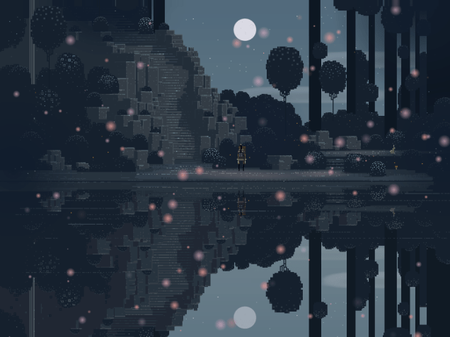
I’ve written about pixel art before, but as someone who was playing games already when pixels were bigger than my hand there’s something about them that speaks to me, and it says things other than, “Put that away! It’s horrible!” I’m wondering to what extent this is nostalgia talking – big pixels remind me of the time when I was young, full of promise and had hair on my head rather than my ears. What does a non-gamer, or someone whose gaming career started at resolutions beyond 320×200, see when they look at pixel art? Do they see technical limitations, or do they see what I and my fellow gaming Methusaleas see?
For me, the stylistic choice made for instance by the developers of Superbrothers: Sword & Sworcery EP (yup, that’s its actual title) is a valid one, since its pixel-heavy goodness achieves a unique effect. It’s not just retro-hipsterish affectation – it’s a valid form of abstraction that is particular to video games. When I look at a screenshot from Sword & Sworcery, I find a highly evocative quality in the image that reminds me of Scott McCloud’s writing on comics. In that medium, the reader is engaged to some extent by the elliptic quality of the frame-by-frame format: we fill in the blanks that are between the individual images. Retro pixel art asks us to fill in the blanks between the pixels; it’s a very specific stylistic cousin to blurring an image for artistic effect. A simple high-resolution paint job would make the picture more specific, more precise, but that evocative potential would be lost in the process. If I think of films that work largely through allusion and ellipsis, such as Andrej Tarkovsky’s Stalker, I imagine something akin to the pixelscapes of Sword & Sworcery more than the more realistic (though also evocative) vistas of the Stalker computer game, a distant cousin of Tarkovsky’s film with very different intentions.
Undoubtedly there’s an economic side to pixel art in indie games: the resources needed to create a game featuring old-school graphics are on an entirely different scale than what goes into flashy, hyperdetailed 3D environments. Beyond this, though, I don’t think that titles such as Papers, Please, Echo of the Wilds or Hyper Light Drifter (you’ll find trailers for all of these below) went with pixel-based artwork because it’s cheaper – all of these aim for a specific effect, an abstraction that at its best can be as gorgeous and evocative as high-detail photography. Even the purposeful ugliness of Hotline Miami and its grotesque ultra-low-res ultra-violence aims for a visual quality that I expect does not only speak to the oldtimers clutching their gamepads. The bigger the space between some pixels, the more space for gamers to lose themselves in.
P.S.: It’s quite fitting that today Rock Paper Shotgun posted an interview with Dave Gilbert, whose Wadjet Eye Games develops old-school low-res pixel art adventure games; in the interview Gilbert says the following: “The great thing about pixel art is it can, how do you explain it? It’s more like your mind fills in a lot of the details when it’s done the right way. When it’s done the wrong way it just looks ugly, that’s the case with any art.”

