In the movies, the past has a certain specific look. Depending on which era is depicted, the film stock is different, the grain is more pronounced, colours are graded according to decade. The ’60s have the yellow-tinted look of an old photo, the ‘80s look neon, and anything before the First World War looks like a painting, its colours burnished. If the past doesn’t look like the past, well, it ain’t authentic, is it?

Filmmakers go against audience expectations at their own risk when it comes to how a film looks. If it goes for a distinctly different aesthetic from what people expect, audiences can turn against it without even giving it the benefit of the doubt: why does it look the way it does? One prominent case of this is Michael Mann’s Public Enemies, which was set in the 1930s but used a high-definition digital aesthetic. It looked distinctly different from the Hollywood gangster epics, the Godfathers and Untouchables; instead, it looked contemporary in a way that jarred with cinematographic convention. (There are certainly critics of Public Enemies‘ cinematography whose dislike goes beyond, “That’s not what the past is supposed to look like”, but there is little actual argument that elaborates on the accusation of ugliness.)

I can sympathise… to some extent. Like most people I love the aesthetics of the films of artists such as the late, great Gordon Willis. I like cinematography that feels like the equivalent of an afternoon at the National Gallery. But I have to admit that I’m bored by conventional wisdom that the past has to look a certain way – that it has to look like the past. There’s something tempting, cosy and nostalgic about codifying the past so that it looks like it belongs in a museum, but it can sap a film of any sense that the story has anything to do with the people watching it. I appreciate cinematographers that aim at making the past look and feel like the present tense – which isn’t the same as making it look like 2019: I’ve seen too many TV movies especially that make history look cheaply contemporary, but usually this goes beyond cinematography into lighting, costumes, make-up and the actors themselves. Those films usually don’t look fresh and alive, they instead look like badly done cosplay.
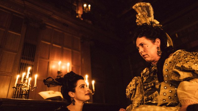
Two of the films I’ve seen recently more than managed to avoid the trap of historical settings resulting in nostalgia-saturated cinematography. The first of these, The Favourite, may look like your conventional costume drama in some of the stills, but in motion the camera work is nervy, constantly putting the audience on edge. Some of cinematographer Robbie Ryan’s more ostentatious choices, such as his use of a fish-eye lens, may be superficially reminiscent of Danny Cohen’s camera work in Tom Hooper’s films The King’s Speech and Les Misérables, but where Cohen’s cinematography in those films lacked coherence, Ryan uses more ostentatious techniques to clever, unsettling and, most importantly, thematically resonant effect. Lanthimos’ characters feel doubly threatened, never at ease, under the antagonistic eyes of the court as much as the distorting eye of the camera. Even in scenes that look more painterly (the naturalistic lighting recalls John Alcott’s work in Barry Lyndon), the effect is never one of cosiness.
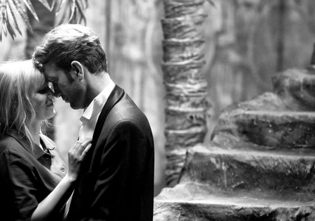
The other film, set in a world very different from Lanthimos’ English court, is Cold War by Polish director Paweł Pawlikowski (which Mege wrote about here). Perhaps it’s easier for the film’s cinematographer Łukasz Żal to signal the past tense of the story (Cold War is set in the decades after the Second World War) due to his use of black and white, but at the same time his images never come across as anything other than present-tense. The passionate, hurtful love story between Zula and Wiktor is set in a now that feels current and alive regardless of what year we find ourselves in.
Obviously not every historical film needs to look like The Favourite or Cold War. But that’s exactly it – while there are clearly cinematographic codes and conventions, there are limitations to codifying them to the point where they become generic. And audiences shouldn’t be complacent or even antagonistic towards films that go against their visual habits. Historical films aren’t museum exhibits, and the cinematic arts shouldn’t be subservient to nostalgia and habit. Regardless of what year a film is set in, it deserves to take place in the now.