There are a number of classic paranoia films made in Hollywood in the 1960s and 1970s. The Manchurian Candidate is one of these, as is Francis Ford Coppola’s The Conversation.
The Parallax View (1974) by Alan J. Pakula clearly belongs on the list as well. It’s a classic, it’s memorable, it’s iconic. It has its finger on the pulse of a country and a culture where politics and murder have been intertwined for more than a century.
In cinematic terms, I sometimes wish I’d already been around during the 1970s. It’s the big films of that decade that I most regret seeing at the cinema. Thank god for good repertory cinemas, though: thanks to my favourite rep cinema, I’ve been able to see the likes of Apocalypse Now on the big screen – and the theatrical experience definitely makes a difference in terms of how potent these classics are.
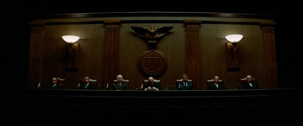
Last week, as part of a series on migrants (which includes such different fare as Jan Troell’s The Emigrants and The New Land and Neill Blomkamp’s District 9), I was finally able to see Francis Ford Coppola’s The Godfather Part II on the big screen. The film is gorgeous to look at, with Gordon Willis’ Rembrandtesque cinematography an absolute triumph, and it’s a joy to see Pacino and De Niro in peak form, their acting specific and nuanced and entirely unlike the personas we’ve seen them embrace all too often since. The way I watch the film has changed in other ways as well, though, and these have nothing to do with the big-screen format. That difference is due to me having watched the entirety of The Sopranos in he meantime.
In the movies, the past has a certain specific look. Depending on which era is depicted, the film stock is different, the grain is more pronounced, colours are graded according to decade. The ’60s have the yellow-tinted look of an old photo, the ‘80s look neon, and anything before the First World War looks like a painting, its colours burnished. If the past doesn’t look like the past, well, it ain’t authentic, is it?
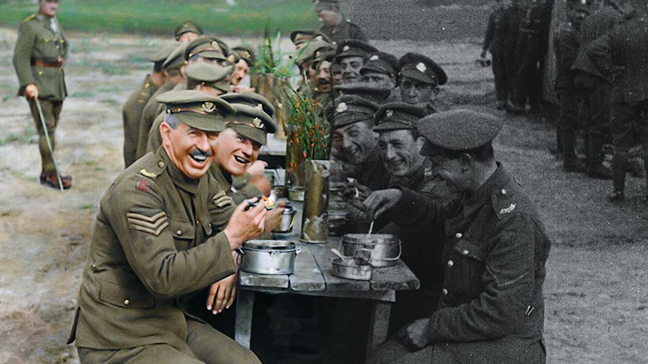
We all know what the past looks like. Go back a hundred years, and the world was black and white, sped up and weirdly jerky. People talked in ornate title cards – which was lucky, because how else could you hold a conversation over the din of a dramatic piano score? Philip Larkin once wrote that sexual intercourse began in 1963; it seems that sound and colour began before that, but not by all that much, compared to the history of the world. It is strange to think that two entire world wars were fought entirely in monochrome.